InMoment Discover

Challenge
Designed a user-centric experience for InMoment's Discover platform, an internationally recognized solution for augmenting human intelligence. The platform transforms raw data from company surveys into actionable insights, surfacing key themes to program owners who can drive meaningful organizational change. For the MVP, the design was intentionally minimal to prioritize speed and ensure content accuracy, creating a streamlined interface that balances advanced analytics with clarity and usability.
Role
Principle UX & UI designer
Tools
Sketch, Inmoment DSM, Photoshop, Illustrator & Zoom
Duration
6 Months
Impact
Gold Stevie® from the 2017 International Business Awards℠ for product of the year.
Solution
InMoment Discover aggregates and analyzes customer feedback from all touchpoints, using AI-powered insights to surface actionable trends and opportunities in real-time. The platform features a unified dashboard, intelligent analysis, and prioritized recommendations that help businesses make data-driven decisions faster than ever before.
The Process

Empathize

The design process began by understanding the challenges faced by program owners and analysts who manage large-scale company surveys. These stakeholders needed a way to quickly uncover meaningful insights without being overwhelmed by raw data. Interviews and research revealed pain points such as:
- Information overload from thousands of survey responses.
- Difficulty identifying patterns that drive actionable change.
- Pressure for speed and accuracy in reporting to leadership.
The team focused on creating an experience that felt approachable and trustworthy, ensuring advanced language algorithms and pattern recognition worked behind the scenes while presenting insights in a clear, minimal interface. This approach prioritized empathy for users' time constraints and decision-making needs, enabling them to act confidently and effectively.

Define

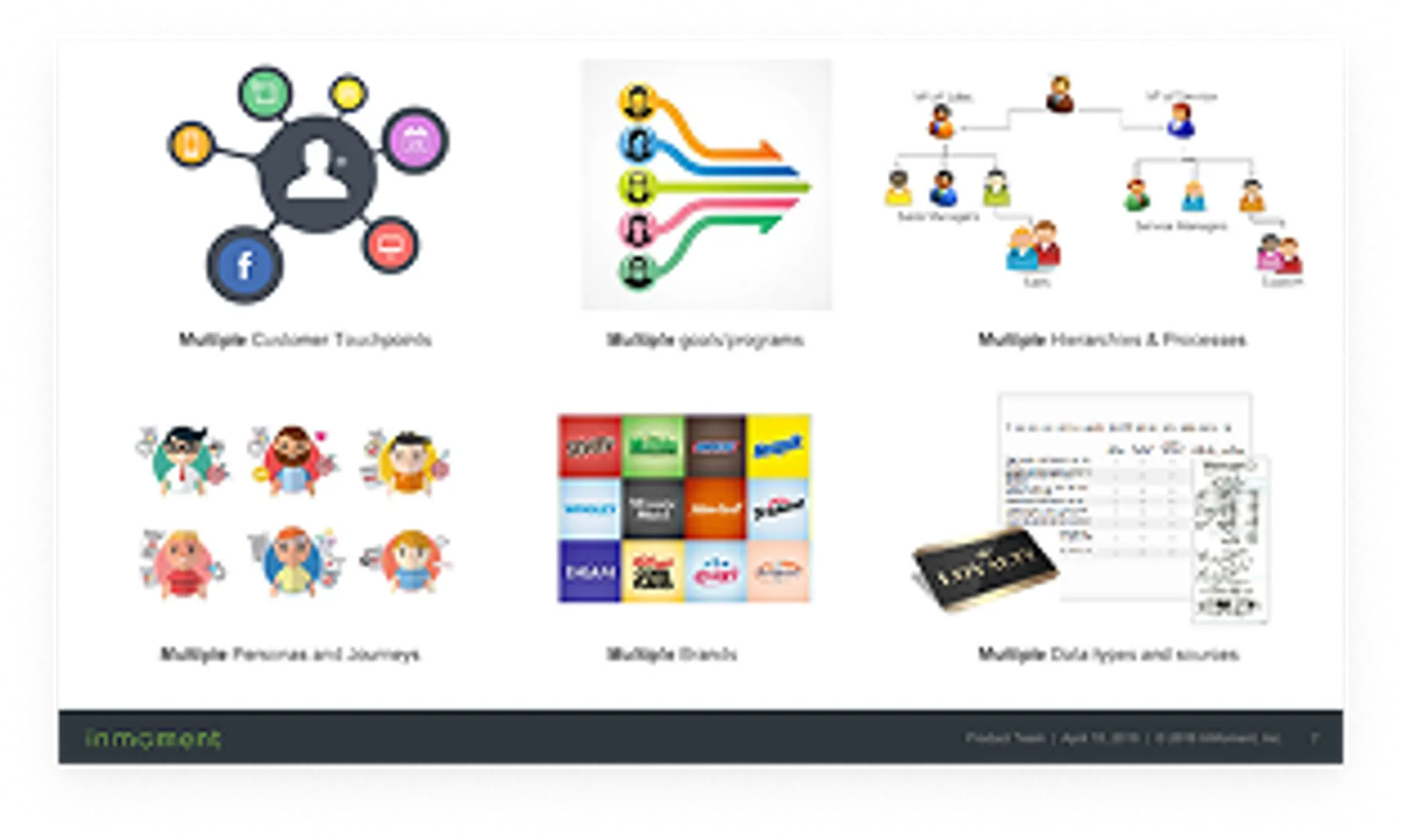
The BBC environment was highly complex, requiring extensive investigation to identify the needs of clients and their customers across multiple industries such as hospitality, retail, and luxury brands. Each organization had unique structures, decision-making hierarchies, and customer experience goals. To design a solution that could scale effectively, the team needed to understand not only the end-user pain points but also the organizational context in which insights would be consumed.
This phase involved creating detailed artifacts to clarify the problem space for each industry.
Brand Overview
- Illustrated the diversity of brands under Caesars (e.g., Harrah's, Caesars Palace, Flamingo, Rio, Planet Hollywood).
- Highlighted the challenge of delivering consistent insights across multiple brand promises and operational models.
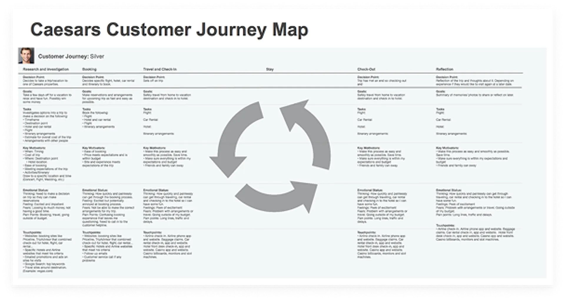
Customer Journey Map (Caesars Example)
- Visualized the end-to-end customer experience across phases: Research and Investigation, Booking, Travel and Check-In, Stay, Check-Out, and Reflection.
- Included decision points, goals, tasks, key motivators, and emotional states for each phase.
- Highlighted pain points and opportunities for improvement, ensuring insights aligned with real customer behaviors.
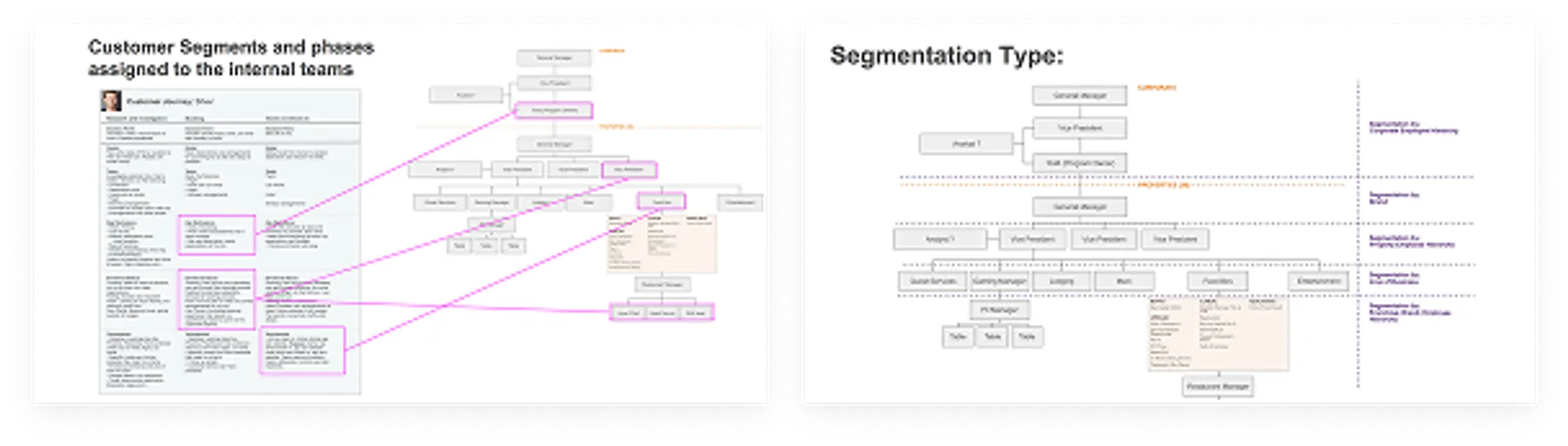
Enterprise Structure Maps
- Showed organizational hierarchies from corporate leadership down to property-level managers.
- Segmented responsibilities by corporate, property, and line of business, ensuring insights flowed to the right decision-makers.
- Included examples like Caesars' structure, which spans multiple brands and properties.
Segmentation Type Diagram
- Defined segmentation by corporate hierarchy, brand, property, and line of business.
- Clarified how insights needed to be filtered and delivered based on organizational complexity.
Customer Segments and Phase Assignments
- Mapped internal teams to specific phases of the customer journey.
- Illustrated which roles (e.g., Vice President, Program Owner, Restaurant Manager) were responsible for acting on insights at different touchpoints.
- Connected customer experience data to operational responsibilities for clarity and accountability.
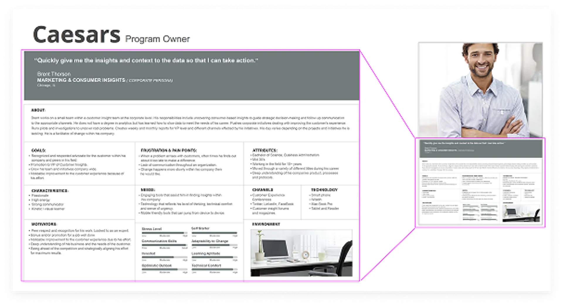
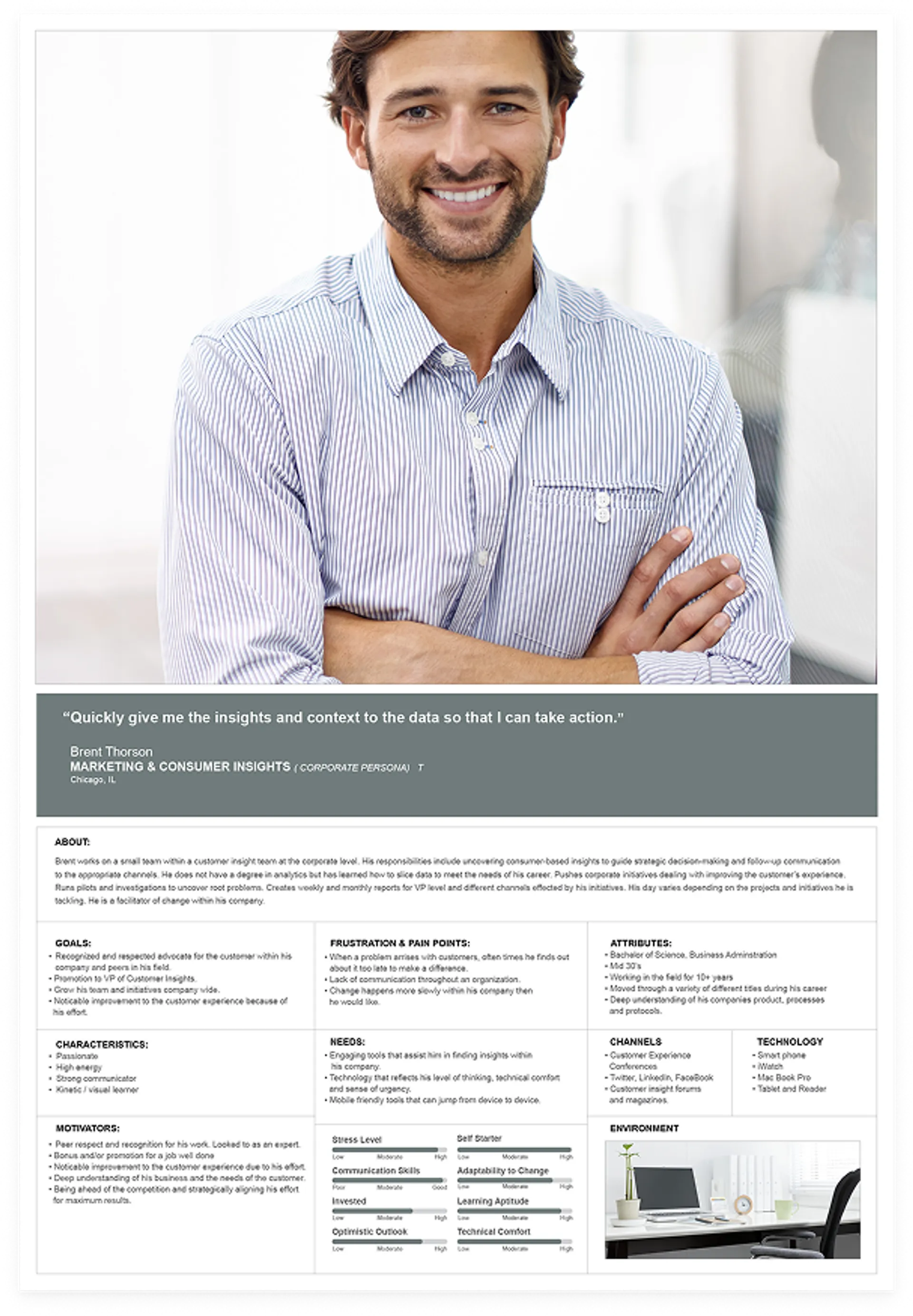
Program Owner Persona
- Detailed goals, frustrations, needs, and motivations of key stakeholders.
- Captured expectations for speed, clarity, and actionable insights to support strategic decisions.
- Included channels and technology preferences to inform design decisions.
Why This Was Critical:
Understanding organizational structure and decision-making roles allowed the team to design a solution
that respected complexity while simplifying the experience for end users. By mapping customer journeys, internal responsibilities, and segmentation
types, the design could deliver high-impact insights to the right stakeholders quickly and effectively.
Ideate

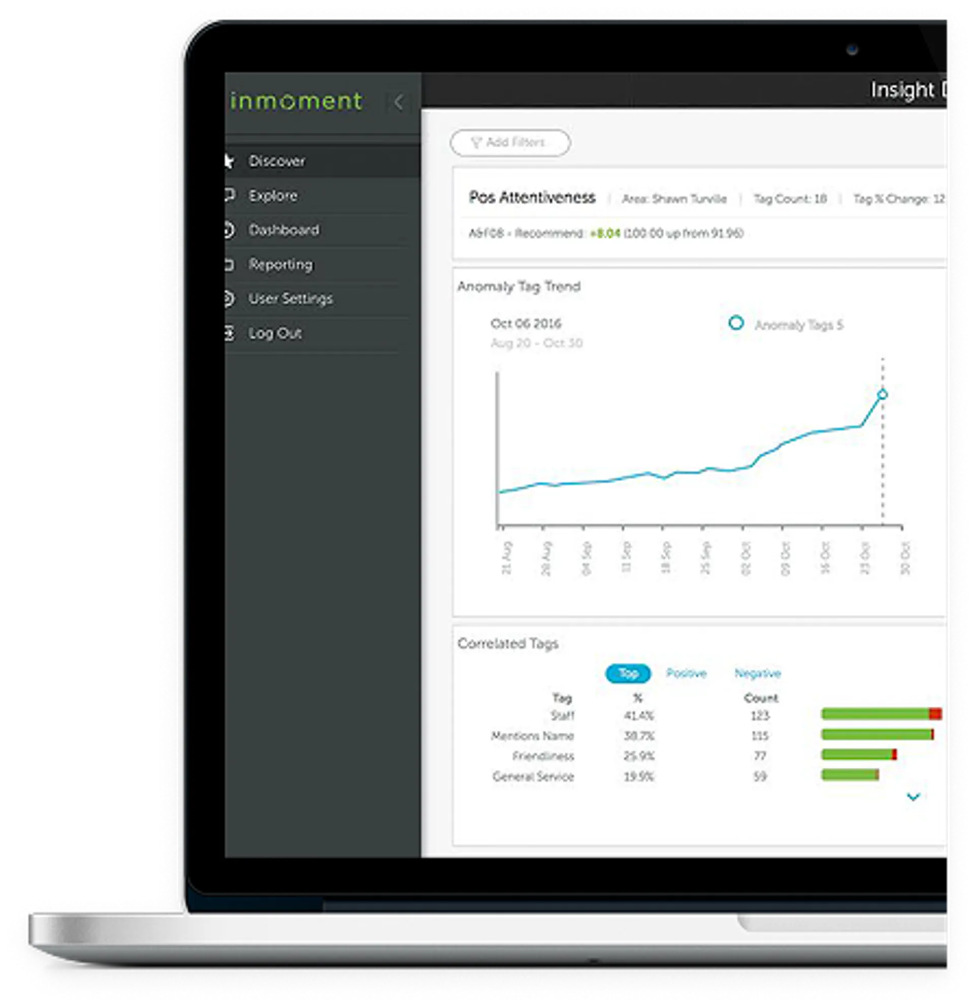
The ideation phase focused on defining the structure and navigation for the admin experience and specifying the content for two core components: Explore (base tools) and Discover (advanced tools). This work laid the foundation for a scalable, intuitive interface.
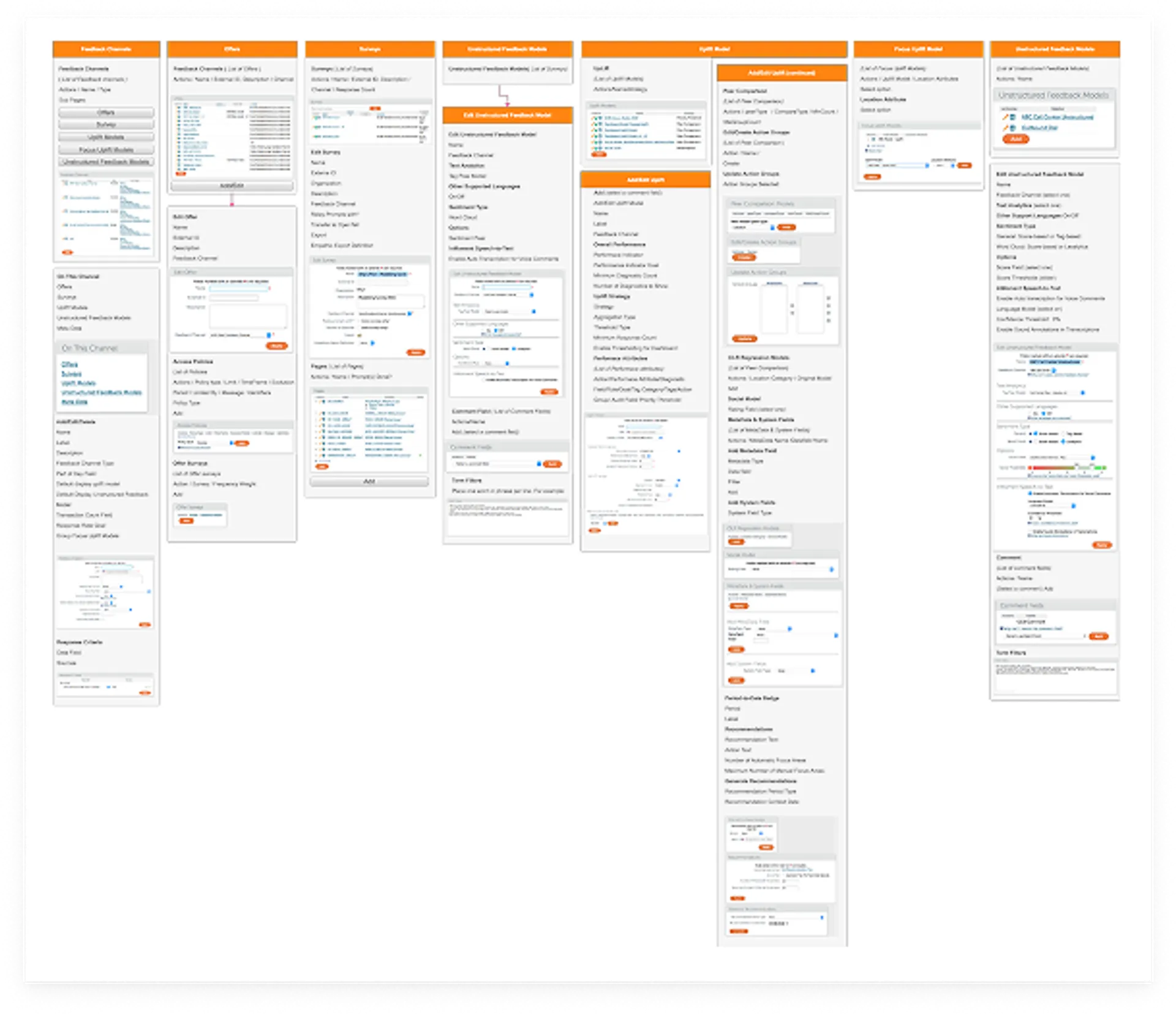
Information Architecture & Navigation Flow
I mapped out the hierarchy and relationships between organizational settings, Explore, and Discover. The IA diagram illustrates:
- Org Settings: High-level configuration for Explore and Discover modes, including status toggles and automation setup.
- Explore Settings: Base tools such as Sentiment Widget, Filtering, Comments Overview, and Search. These were grouped for quick access and simplicity.
- Discover Settings: Advanced tools for deeper insights, including:
- Insight Configuration: Tag categories, language settings, and filters.
- Scheduler: Frequency and date range controls.
- Widget Setup: Complex widgets like Insight Overview, Keyword Themes, Location, and Combined Tag Insights.
This structure ensured that users could easily move from simple exploration to advanced discovery without friction.
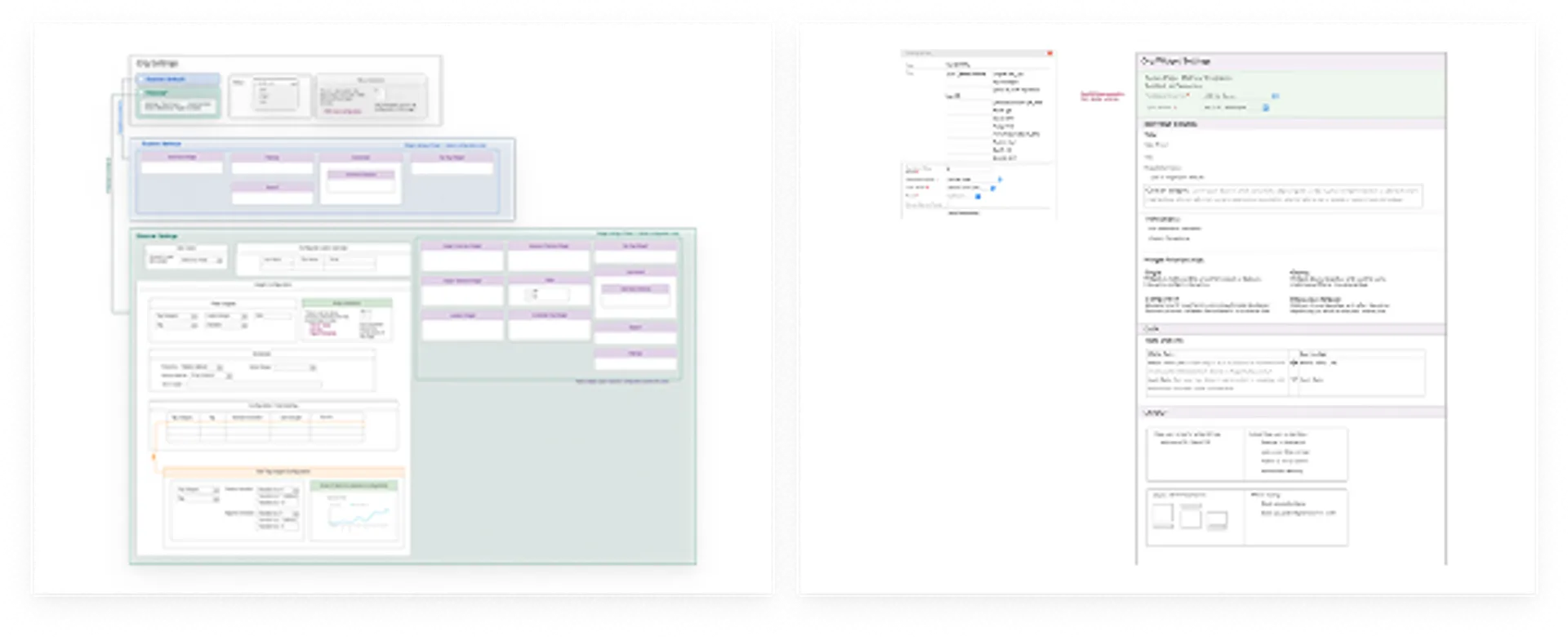
Wireframes & Component Design
I created wireframes to visualize:
- Explore Panel: A streamlined layout for quick sentiment analysis and filtering.
- Discover Panel: A more robust interface with configurable widgets, insights, timelines, and advanced filtering options.
- Widget Settings: Goals, translations, and relationships (single, grouped, or comparative).
- Data Options: Selection of datasets and formulas for metrics.
- Layout Controls: Responsive configurations for desktop and mobile, including scaling and grouping behaviors.
Content Definition
I identified and documented the exact content for each component:
- Explore: Focused on essential tools for quick insights—sentiment, filtering, comments, and search.
- Discover: Included advanced analytics like trend widgets, audit data, and visualization options for metrics over time.

Prototype

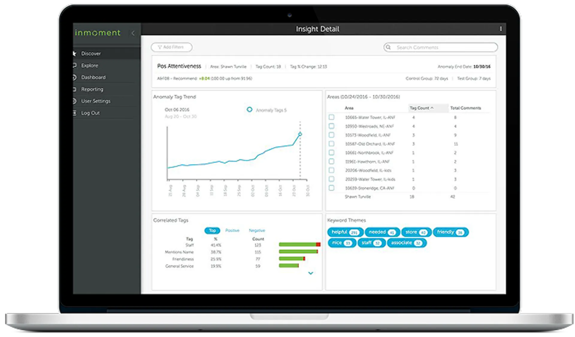
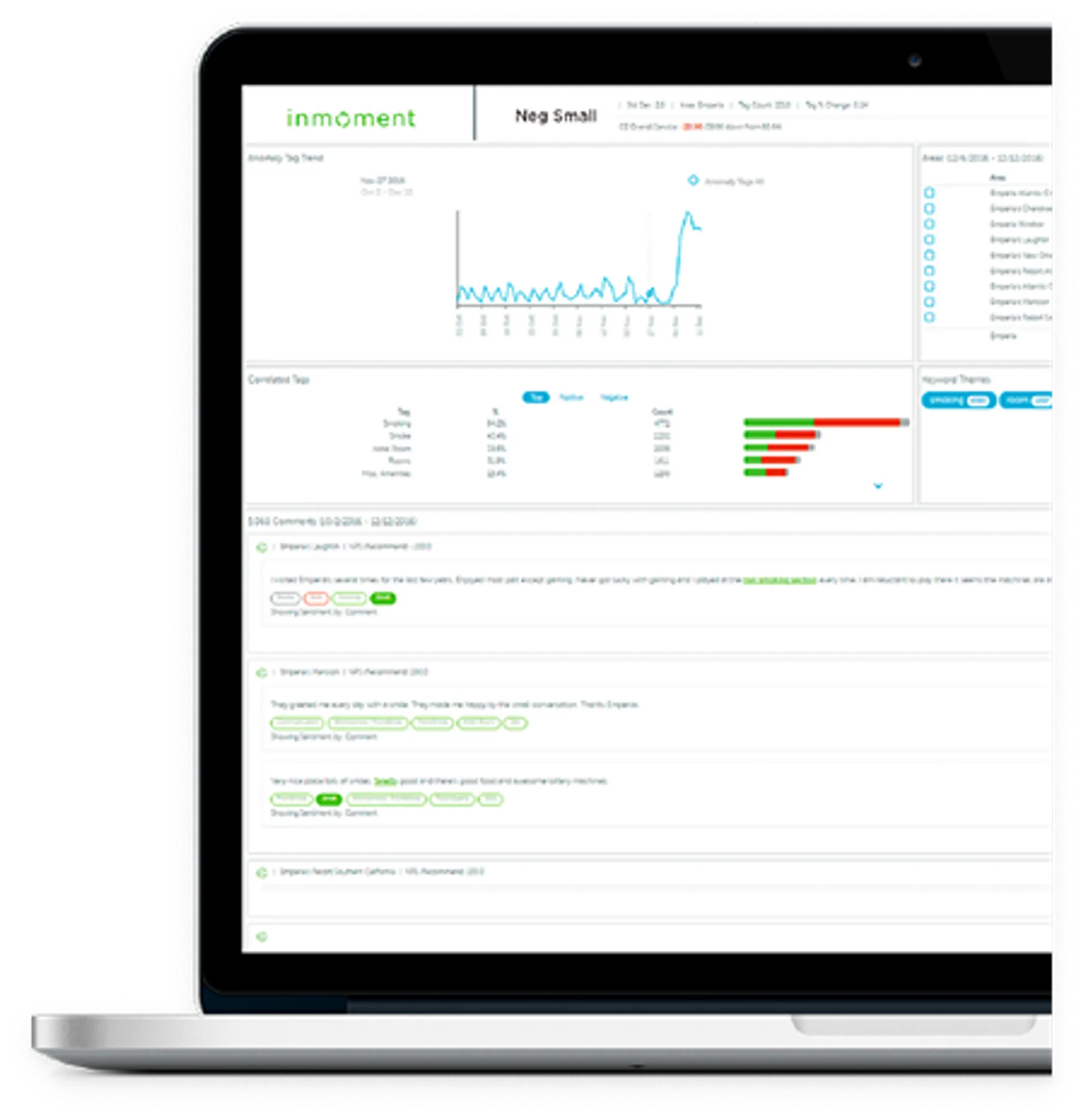
This prototype represents the Insight Detail interface designed to help users uncover patterns and anomalies in customer feedback data.
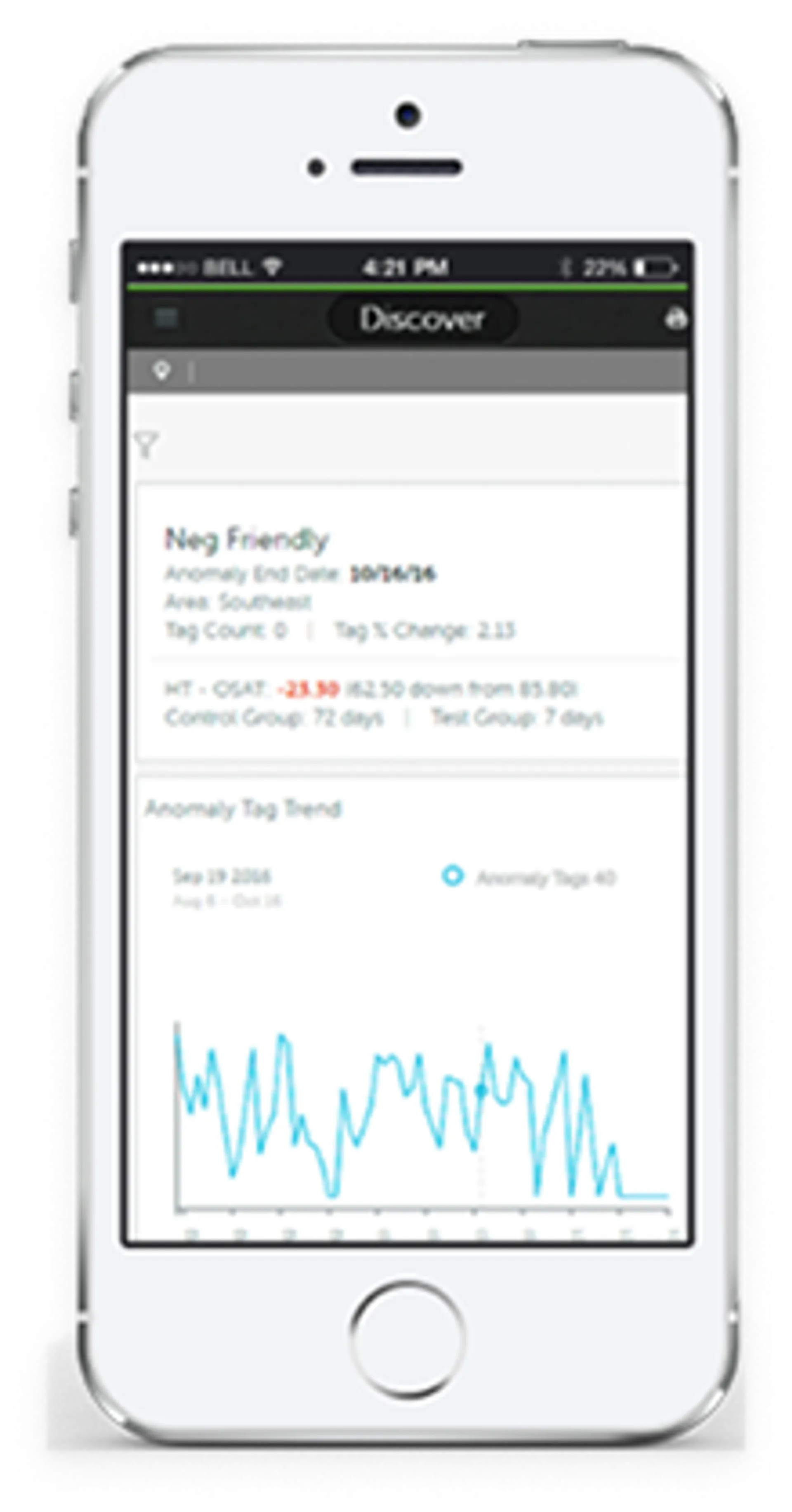
Key Features of the Design:
- Anomaly Tag Trend Visualization: Displays changes over time, allowing users to quickly identify spikes or shifts in customer sentiment.
- Area-Level Insights: Breaks down data by location or segment for granular analysis.
- Correlated Tags & Keyword Themes: Highlights related topics and themes to surface emerging trends and contextual insights.
- Interactive Filters: Enables users to refine views and focus on specific timeframes or data subsets.
Created a comprehensive component library including data cards, charts, filters, and controls. Every component was designed to work together as a cohesive system while maintaining flexibility for different use cases across the platform.
Test

After designing this prototype, we imported real customer data from select beta partners, including Tiffany & Co., Tesco, Caesars Entertainment, and Hawaiian Airlines. These clients worked closely with us during the beta phase, providing invaluable feedback that helped us:
- Streamline the design for better usability and navigation.
- Identify and resolve bugs before full-scale deployment.
- Prioritize the most important insights based on real-world use cases, ensuring the tool delivered maximum value for decision-making.
This collaborative approach ensured the final product was not only visually intuitive but also deeply aligned with the needs of enterprise users.
Implement

Both the company and our clients were highly satisfied with the new product. The improvements not only enhanced usability and performance but also delivered meaningful business insights. As a result of these efforts, we were honored with the Gold Stevie® Award from the 2017 International Business Awards℠ for Product of the Year, recognizing excellence in innovation and customer experience.

After incorporating feedback from our beta partners and refining the design, we released the product to all clients. The launch marked a major milestone, delivering a streamlined, insight-driven experience across the platform.
Post-Launch Strategy:
- Analytics Monitoring: We tracked usage patterns, engagement metrics, and performance data to validate adoption and identify opportunities for improvement.
- Insight Prioritization: Observed which features and insights were most valuable to clients, guiding future enhancements.
- Continuous Feedback Loop: Maintained open communication with clients to capture real-world input and ensure the platform evolved with their needs.